Appearance
The Appearance settings let you customize how messages and visuals are displayed in your scene. The Appearance group in the settings sidebar holds two pages: Messages and Visuals.
While you edit appearance settings, the scene view previews your changes live; they only become permanent when you save.
Messages
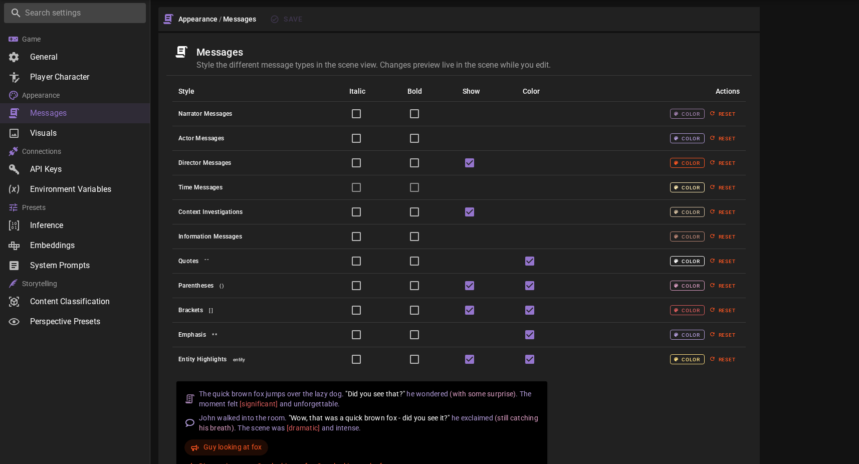
The Messages page gives you control over how text appears in the scene feed. You can customize the styling for different message types and special text formatting.
Message Types
Configure the appearance of each type of message that appears in your scene:
| Message Type | Description |
|---|---|
| Narrator Messages | Descriptive text that sets the scene and describes actions |
| Actor Messages | Dialogue and actions from characters |
| Director Messages | Instructions and guidance from the director agent |
| Time Messages | Indicators showing the passage of time |
| Context Investigations | Results from context investigation queries |
For each message type, you can configure:
- Italic - Display the message text in italics
- Bold - Display the message text in bold
- Show - Toggle visibility of certain message types (available for Director Messages and Context Investigations)
- Color - Set a custom color for the message type
Text Markup Styling
One of the key features in version 0.35.0 is the ability to independently configure how special text markup is displayed. This gives you fine-grained control over the visual presentation of different text elements.
You can configure these markup styles:
| Markup | Symbols | Example |
|---|---|---|
| Quotes | " " |
"Hello there!" |
| Parentheses | ( ) |
(whispering softly) |
| Brackets | [ ] |
[Author's note] |
| Emphasis | * * |
dramatic pause |
| Entity Highlights | — | clickable entity highlights in the latest message |
For each markup type, you can set:
- Italic - Render the marked text in italics
- Bold - Render the marked text in bold
- Color - Enable or disable color override. When enabled, the markup uses its own configured color. When disabled, it inherits the color from the surrounding message type.
Color Override
The Color checkbox for markup styles controls whether that markup uses its own dedicated color or inherits from the message type it appears in. This is useful when you want quotes to stand out in a different color, or when you prefer a more uniform look where all text within a message shares the same color.
Live Preview
As you adjust your settings, the preview panel on the left side of the settings window shows you exactly how your messages will look. The preview includes examples of:
- Narrator text with various markup types
- Character dialogue with quotes and actions
- Director instructions
- Time passage indicators
- Context investigation results
This makes it easy to experiment with different combinations until you find a style you like.
Setting Custom Colors
To change a color:
- Click the Color button next to the message or markup type you want to customize
- Use the color picker that appears on the right side of the panel
- The preview updates immediately so you can see the result
- Click Reset to return to the default color
Visuals
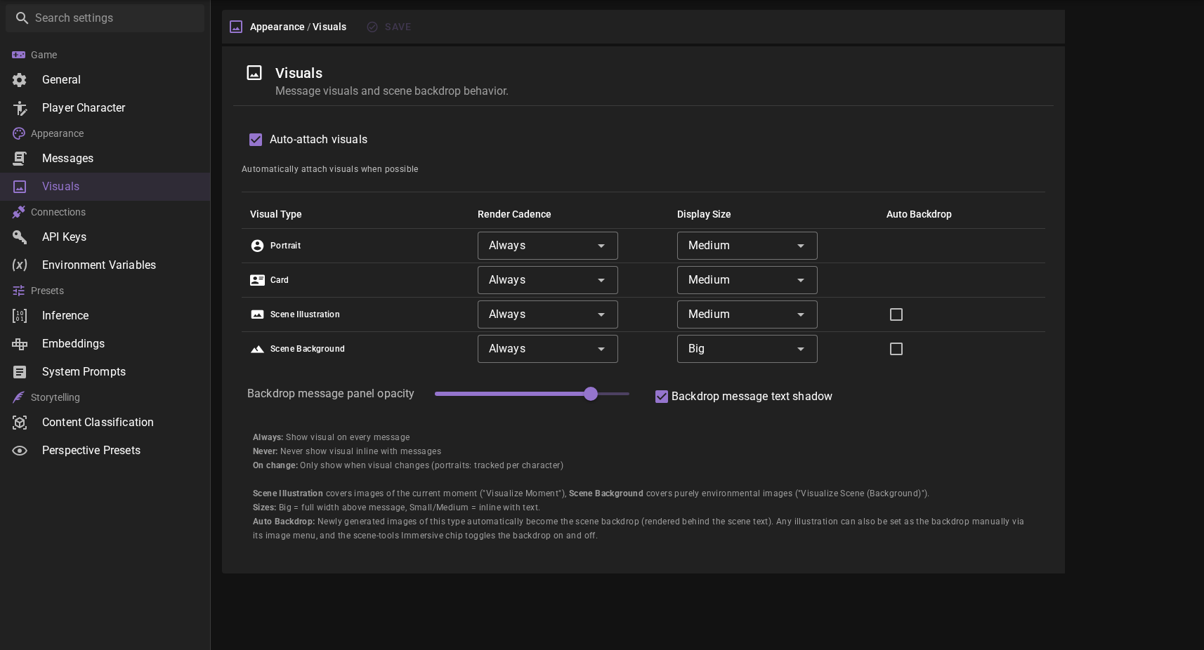
The Visuals page controls how images appear alongside messages in your scene feed. This includes character portraits, cards, scene illustrations, and scene backgrounds.
Visual Types
Configure display settings for each type of visual:
| Visual Type | Description |
|---|---|
| Portrait | Character portraits that appear next to character messages |
| Card | Character or scene cards that can be attached to messages |
| Scene Illustration | Images of the current moment ("Visualize Moment") attached to messages |
| Scene Background | Purely environmental images ("Visualize Scene (Background)") |
Display Settings
For each visual type, you can configure:
Render Cadence
Controls when the visual is displayed:
- Always - Show the visual on every message that has one (default)
- On Change - Only show when the visual differs from the previous message of the same type (portraits only)
- Never - Hide this type of visual entirely
Using On Change for Portraits
Setting portrait cadence to On Change can reduce visual clutter in long conversations. The character's portrait will only appear when it changes, such as when the character's expression or appearance shifts during the scene.
Display Size
Controls how large the visual appears:
- Small - Compact display, good for keeping focus on the text
- Medium - Balanced size (default)
- Big - Large display, scene illustrations appear above the message
Scene Illustration Positioning
When set to Big, scene illustrations display above the message text rather than inline. This gives them more prominence and works well for important scene moments.
Auto Backdrop
Available for Scene Illustration and Scene Background. When enabled, newly generated images of that type automatically become the scene backdrop — rendered behind the scene text instead of only appearing inline. Off by default for both types.
Any illustration can also be set as the backdrop manually via its image menu, and the scene tools Immersive chip toggles the backdrop on and off.
Backdrop Legibility
When a backdrop is active, message text sits on translucent panels so it stays readable over the image. Two settings control this:
- Backdrop message panel opacity - How opaque the panels behind the message text are. Defaults to
0.8; lower values let more of the backdrop show through. - Backdrop message text shadow - Renders a subtle drop shadow behind the message text for extra contrast. On by default.
Auto-attach Visuals
When enabled (the default), newly generated visuals are automatically attached to the relevant messages in your scene. Disable this if you prefer to manually manage which images appear with which messages.